Client: Our family-owned business needs a refresh
Angle: The O’LEX factor


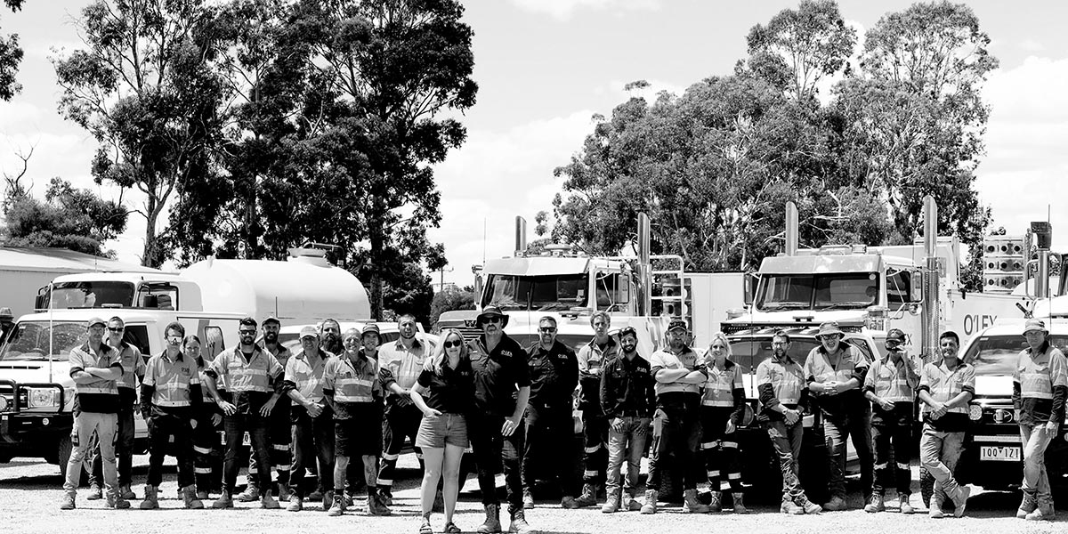
The owners of O’Loughlin Excavations, a 20-year old civil construction company in Victoria Australia, approached Angle looking for a rebrand. Taking their growing offer and capability into account, the brief was to refresh their look and to help them compete more effectively. First we researched their competitive sector, discussed our findings and agreed on brand positioning.
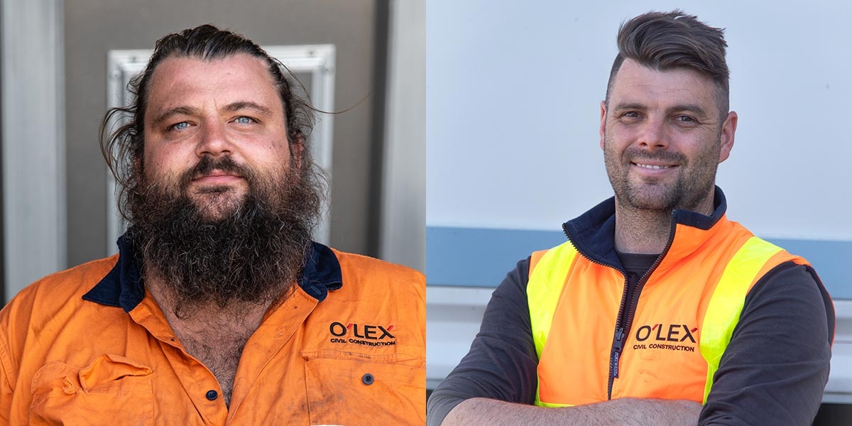
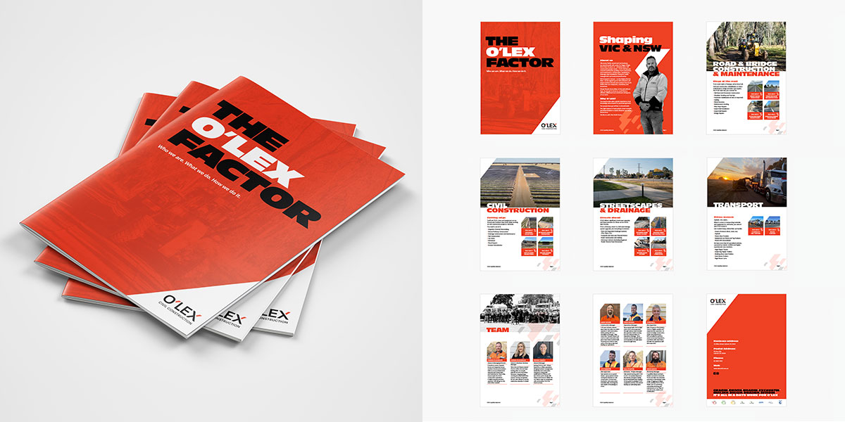
We identified an opportunity to develop a highly professional brand that communicated a sense of scale, experience and capability, like a larger contractor. But at the same time, we wanted O’LEX to look and sound more personal and hands-on than the competitors. The O’Loughlin family owners are well known in the civil construction sector, so Angle set out to rebrand the business without losing the goodwill that they had already established.
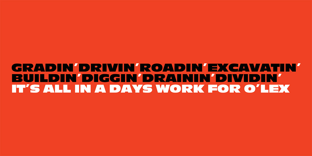
From the very first logo sketch, Angle wanted to keep a strong family connection in the name and the logo. By shortening O’Loughlin Excavations to O’LEX we achieved exactly that. The apostrophe was the key –keeping it made a reference to O’Loughlin and it also meant that people were more likely to pronounce ‘Oh-Lex’ rather than ‘Olex’.
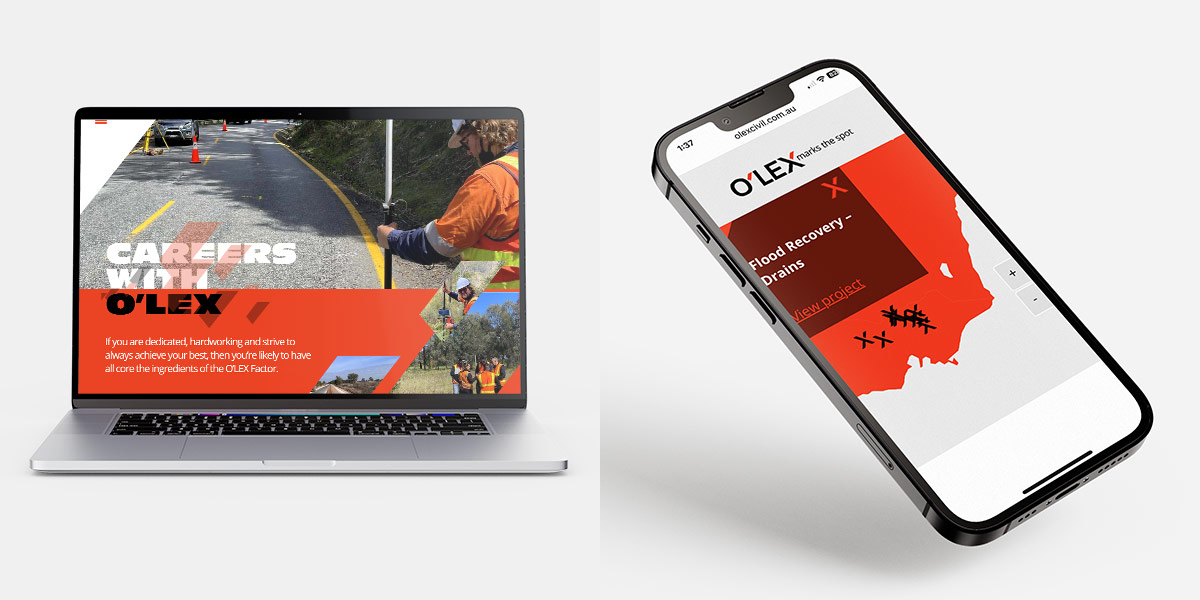
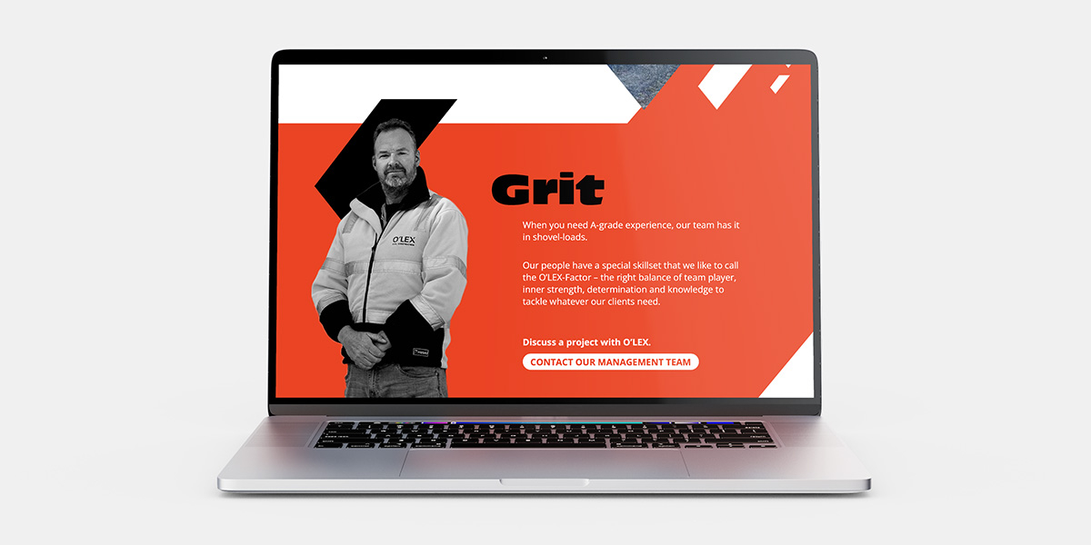
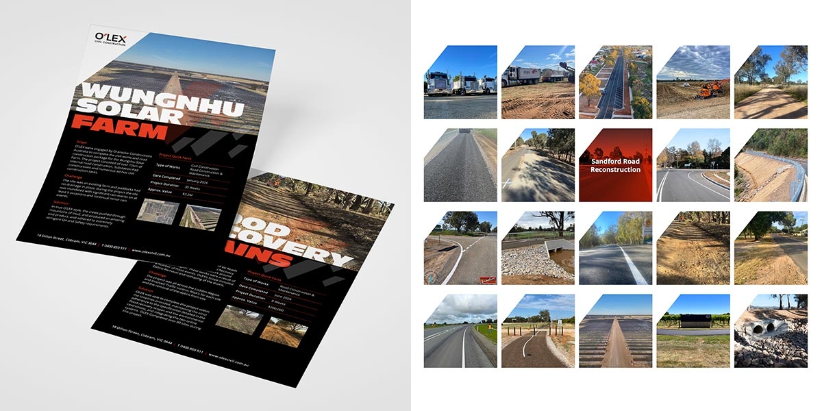
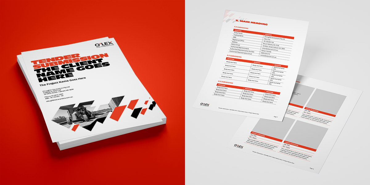
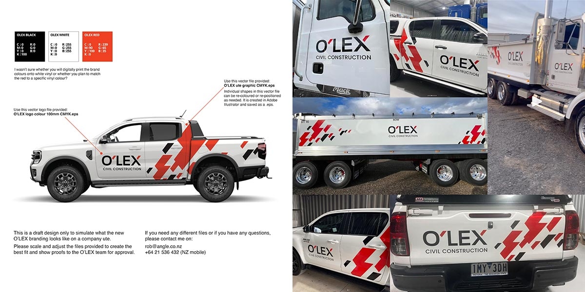
The brand identity features three colours: red, black and white – specifically chosen to reference the old brand and also to stand out against major competitors. Combining bold typography, clever language, real photography and the apostrophe-shaped graphic creates a dynamic identity that shows a personal, hands-on approach with large project capability and experience. To date we have worked with the O’LEX team on their website, capability brochure, tender submission template, case studies, email signatures, signage and fleet branding.
Contact us, we’re experts with a down to earth approach.
| Categories | |
| Client | O'LEX Civil Construction (formerly O'Loughlin Excavations) |
| Country | Victoria, Australia |
| Visit Site | olexcivil.com.au |