Q: How do we bring Run Jump Throw to life?
Angle: Branding fit for kids
Run Jump Throw is Athletics New Zealand’s foundation programme for teaching athletics skills to kids aged 6-11. It’s based on the philosophy that the development of skills, in a fun environment, is the key to participation. The emphasis is on the development of fundamental movement patterns specific to athletics. The brand was re-launched at the 2017 Club Connect Conference.
Angle was commissioned to rebrand the Run Jump Throw training programme by Athletics New Zealand’s Club Development Manager. We were given copies of the existing printed collateral which were dated and out of character with the organisation’s high profile and their level of professionalism. A hurdling cartoon Kiwi logo mixed with a techy-looking coaching manual cover and very plain, text-heavy content just didn’t do the programme justice. Our brief was to bring Run Jump Throw to life with a full rebrand.
The whole project ran for a period of 10 months. The collaborative process, managed and guided by Angle at every step included multiple concept presentations, the creation and presentation of brand mood boards and a few rounds of sample illustrations. These were presented to the Run Jump Throw Working Group, consisting of key partners and coaches from around NZ, for feedback and approval.
Once we had approval on a new logo and all the other brand visual assets, we started to re-design and re-structure two key Run Jump Throw training resources page by page, as content became available. New illustrations were crafted for all activities and eventually a fresh, new look was pieced together.
Proofs of the final print-ready artwork were checked and approved by the client, after which we agreed to make full production prototypes of the two resources. This was a smart move that allowed Angle and Athletics New Zealand to see exactly what the finished items would be like and built confidence on both sides before committing larger sums of money into a full print run.
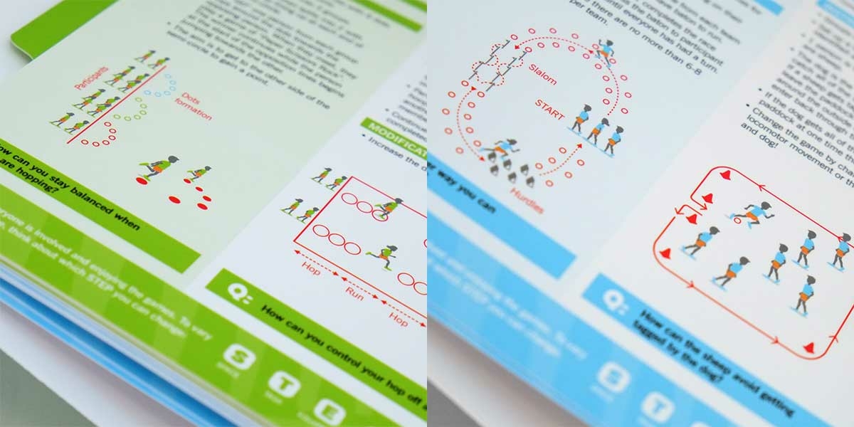
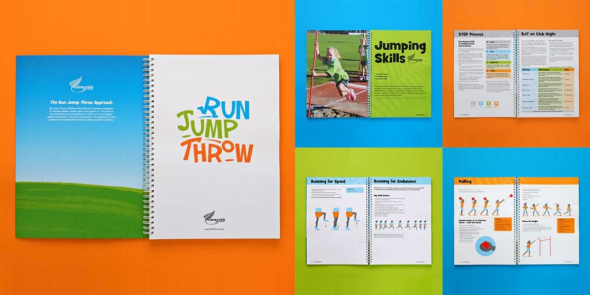
Run Jump Throw is now inspiring, easy to follow and informative. The programme looks like fun and encourages participation with clear illustrations and simple instructional text for all activities .
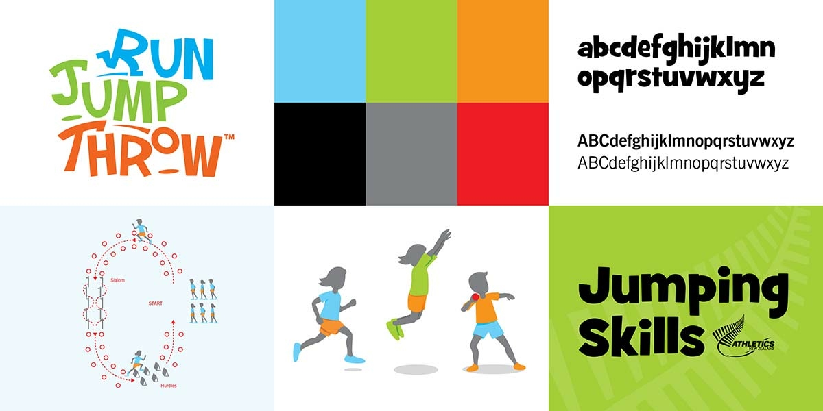
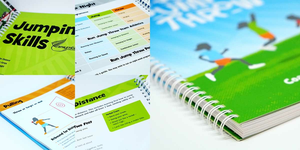
The new logo is informal and expressive. Using hand drawn lettering, we represent the three actions of running, jumping and throwing within the name and each is given a different colour. Two logo formats – a stacked arrangement and a horizontal composition allow the logo to be used flexibly but consistently.
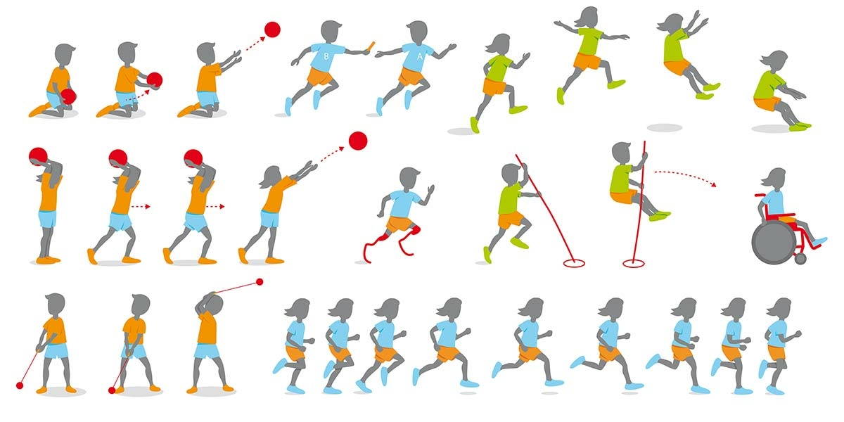
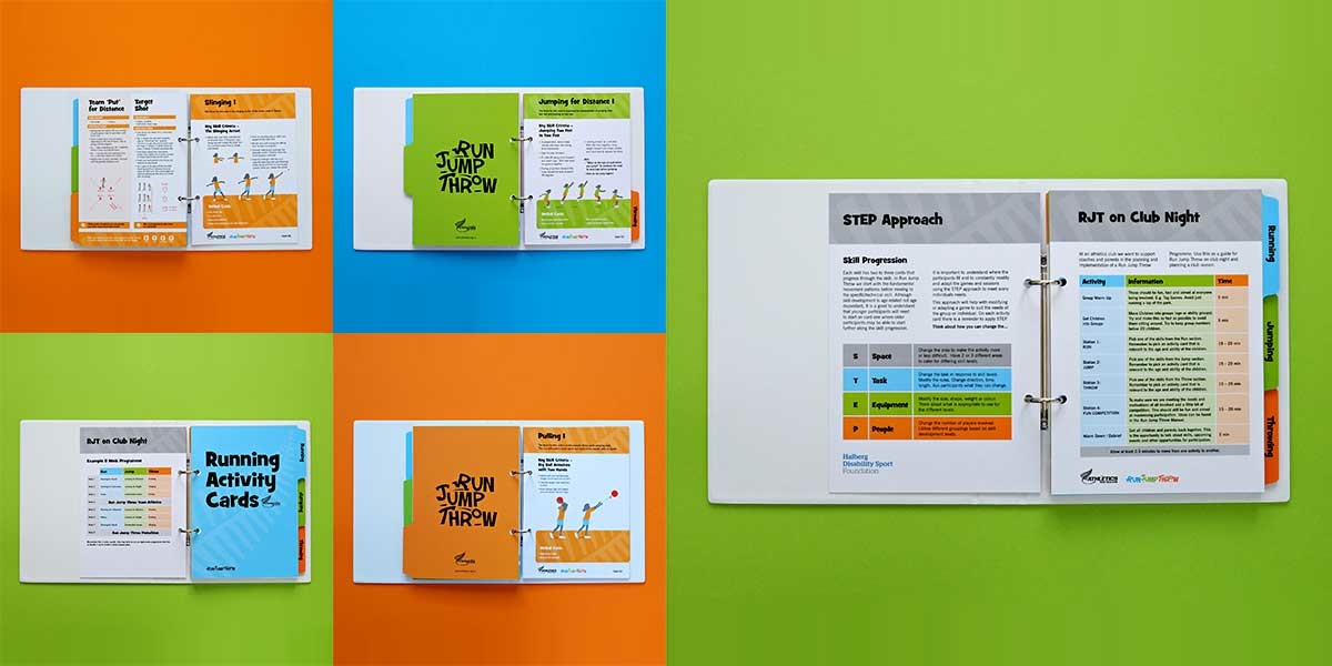
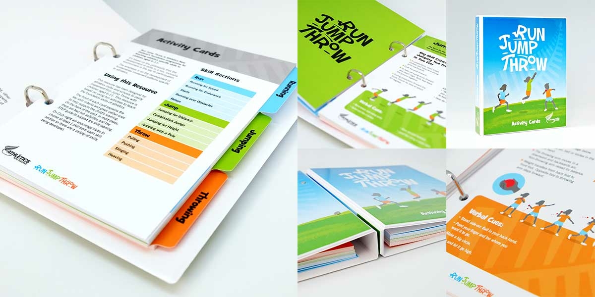
Illustrated figures and activities are a major component of the Run Jump Throw programme. We represent male and female participants in an age-appropriate style using flat colour, with a hint of shadow and detail. All the figures are grey silhouettes with colour coded sports clothing and just enough detail to ‘describe’ the many different activities and skills. The cue for the colour coding originates from the logo – blue for running, green for jumping and orange for throwing.
Run Jump Throw typography brings a new layer of personality into the mix. A bold, informal script is the perfect headline font, adding a child-like touch while still being clearly legible. This is paired with a Roman and Bold weight sans serif font for all the factual content.
We’ve already mentioned the use of colour in the illustration paragraph but colour also plays a key role throughout the resources. Blue, green and orange are used to create sections and segregate different activities and skills.
The short answer is a new brand and two printed training resources but our solution provides so much more. Angle’s skills in Branding and Design for print have ensured that Athletics New Zealand can launch a revitalised programme that works in tandem with the NZ Schools Curriculum. And with their vision of ‘All New Zealanders engaged in athletics’ Athletics New Zealand can use Run Jump Throw throughout the club, school and coaching networks to inspire the next generation of Kiwi athletes.
Introduced during September 2017 to the regional delivery network, the programme is now promoted and implemented in each region. The resources are also available on the Athletics NZ website and will be promoted through various communications to the club and school network.
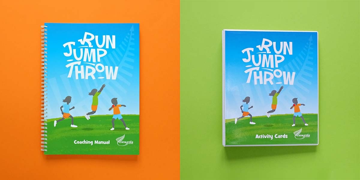
In a practical sense we have delivered two valuable and usable training resources. The A4 Coaching Manual is wire-o bound so pages can lie completely flat when the book is opened. The A5 Activity Cards are matt laminated on both sides for protection (these cards are likely to be removed from their ring binder and used in teaching sessions). The ring binder itself allows for cards to be easily removed and replaced. The cover and spine design is printed and fully encapsulated in clear plastic for protection.
The final pay-off is the delivery of a very distinctive and flexible suite of visual assets that can be used online and across other channels in the future. The logo and all the illustrations are vector (outlined) digital files and as such, can be scaled without loss of quality. PDF pages can be shared and printed, banded certificates and competition score sheets have consistent branding and the colour palette is easy to reproduce consistently.
| Categories | |
| Client | Athletics New Zealand Testimonial |
| Country | New Zealand |
| Size | A4 & A5 |
| Finish | A4 manual: HP Indigo digital print + matt laminated and French-folded covers. Punched and wire-o bound. A5 Activity Cards: Indigo digital print + matt laminated. White 20mm 2D ring binder with digitally printed and encapsulated cover and spine. |