Polishing the Kiwi brand
4th February 2020
Brand thinking by Angle Ltd – 04 Feb 2020
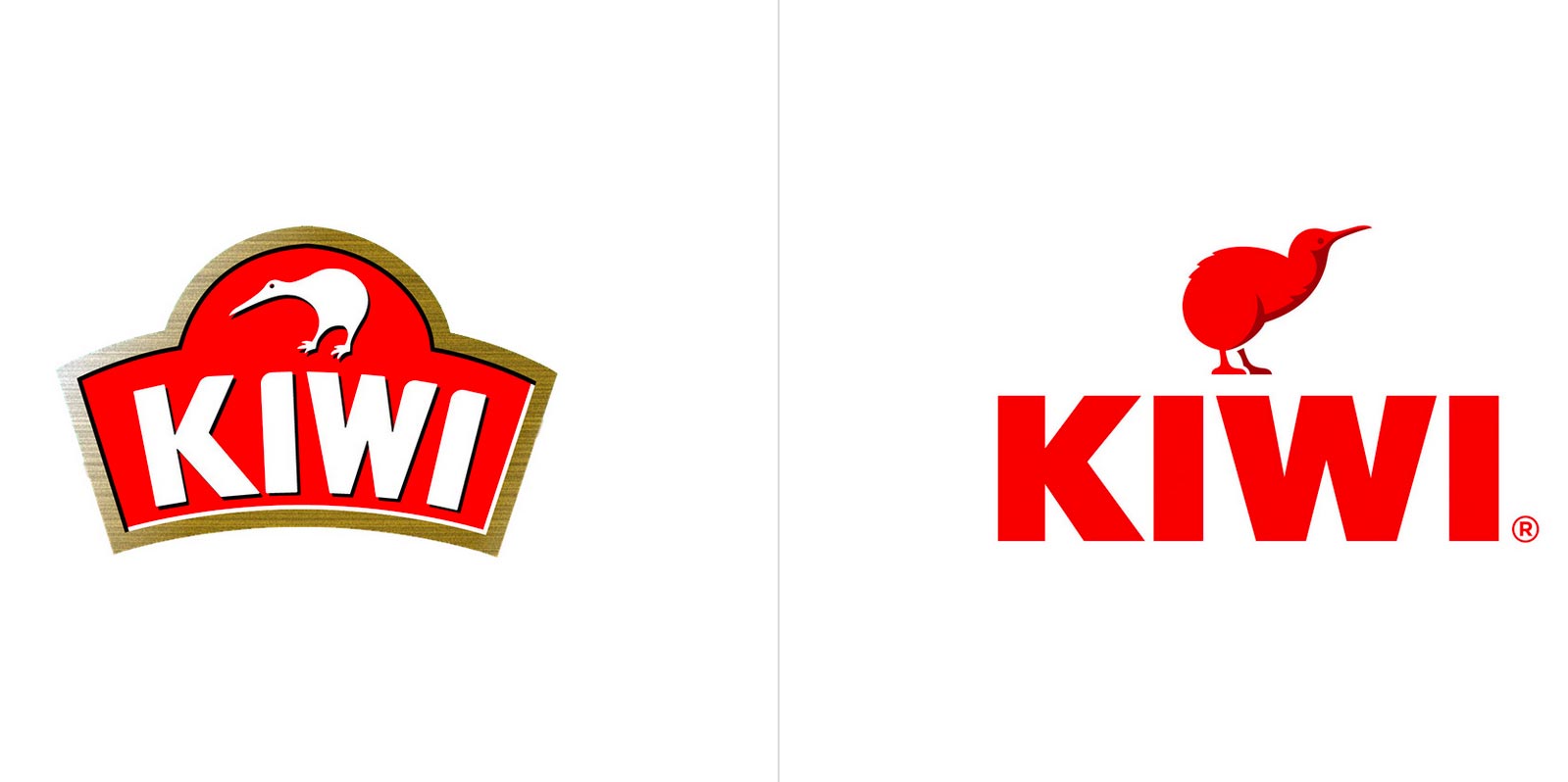
Kiwi, the world famous shoe polish was re-branded in 2019. This 114 year old brand is sold worldwide – a truly iconic, global brand.

What’s changed in the rebrand?
Gone is the slightly awkward looking Kiwi icon above the name – replaced with a re-drawn ‘brand character’ with more ‘confidence and swagger’.
The new bird has a more realistic form with shading and definition. It also faces upwards and looks to the right.
Noticeably absent in the rebrand is the distinctive curved shield that used to house the bird icon and the name.
The new logotype has been designed using bold, sans serif lettering – solid red on a white background and solid white on a red background. The lettering is now horizontal rather than curved.
Tread carefully when rebranding
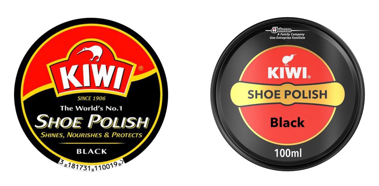
All rebrands need to be handled with care and there is no doubt that this has been handled professionally. But what’s interesting to note is that the black drop shadow on the name, the Kiwi and the shield have all been removed. And while that simplifies the overall look, especially when applied to packaging, you could argue that the logo’s visibility on packs has been reduced and some of the brand’s recognisable heritage has been lost.

In New Zealand, we are so familiar with the Kiwi and we see many variations of this icon on a daily basis (think TradeMe, Kiwi Made, Canterbury, NZ Air Force, New Zealand Rugby League and many more). Despite its name, the Kiwi shoe polish brand was established in Australia by William Ramsay in 1906. He named it after his wife, Annie who was a New Zealander.
So what do you think?
Any rebrand causes positive and negative reactions. As observers, we don’t know the brief that was given or the results that have been achieved by the rebranding. But everyone will feel some ‘ownership’ of this brand because it’s a household name. So what do you think? Has it been polished to perfection or would you stick the boot in?
I encourage you to have a look at this rebranding case study link and see for yourself.
And at the bottom of this page, you can read comments from other people.
Talk to Angle about brand experience and communications
If you want to build a memorable brand experience, contact Angle Limited.
We are a full service branding and communications agency with a solid track record of brand experience projects. We deliver the full package of skills that you need to get your brand fighting fit. Find out about our creative and strategic services – we’re experts with a down to earth approach.

Rob Holloway is the Owner & Creative Director of Angle Limited. Angle has clients in NZ, Europe & Australia. Our point of difference is our ability to create a point of difference for our customers. We help people grow successful brands by making them stand out, by solving problems, building customer experiences and driving results.
